12.03.2009

MFA show review

The labels weren’t up yet for many of the pieces, but I’ll just describe them. The photographs to the left of the entrance were interesting. They are stimulating images that seem to have an elaborate conceptual meaning, although the point wasn’t quite made clear to me. Maybe the title would give some clues, although I don’t think its necessary to know the meaning to enjoy the visual elements of the photographs. I also enjoyed the large abstract landscape paintings in the room on the far left. The bright, almost neon pigments seem to come straight from the tube. The violent brushstrokes blend to create softer imagery and it seems to speak about painting itself. It reminds me of Paper Rad, being almost a visual attack on the viewer, with the vibrancy of the colors and the animated brushstrokes.

I also enjoyed the pieces entitled Barn Wood and Bottles and Bones. The installation comprised of seemingly useless objects created beautiful negative spaces. It’s simple and pleasant to look at. I like the intimacy of smaller objects and I don’t know if this would be completely against the artist’s objective, because I’m not very good at reading into meanings, but I think it would be effective if the pieces were shown in greater quantity. Lastly I enjoyed Erin Dunn’s installation in the room to the far right. What I liked most were the small topiary models and landscapes inside the bell jars. I thought they were beautiful and had a nostalgic feel, which was enhance by the old boxes and spools of string. They created a space that you longed to be in while still withholding that from the viewers creating a tension. The other works in the room kind of get lost because that installation had so much going on. It makes me think that the piece probably should’ve had its own room.

11.13.2009

go big or go home.


TOP MFA SCHOOLS
if i'm going to grad school(which I wasn't planning on) I'm going for the name:

So if these are the top five schools, supposing I could get into one of these programs, I would go to one of them and get a lot more in debt.

TAKASHI MURAKAMI @ the gagosian

I liked the chapter about Murakami in Seven Days in the Art World, but I had only seen his more commercial stuff beforehand, such as the Kanye West album cover. I was excited to have the opportunity to see his work in person after reading about his past work. The piece was extremely large taking over nearly a whole wall in the gallery. Its seems that his style has changed dramatically since that article was written, while style keeping with his themes. The work described in the book and the work of his that I had looked at online was unrealistically clean and solid colors which often created a flat surface. I was also happy to see a departure from the hyper sexuality he used in his sculptures simply as a matter of personal taste.
The painting was heavily layered with many competing textures overlapped by dripping paint. The painting was so impressive. It just engulfed you and had so many details and areas of interest. I could've looked at it for an hour. I am also glad to have seen it in person, because the minute details and the vast size would be hard to imagine in a reproduction. I like the mountain of tiny skulls(also a matter of personal taste) and the composite cheshire cat type of animal sitting at top. I was not at all disappointed, but to be honest I had almost expected to see a larger quantity of work (not that I wish there was, because the one was enough) after reading about his assembly line and his work ethic.

11.04.2009

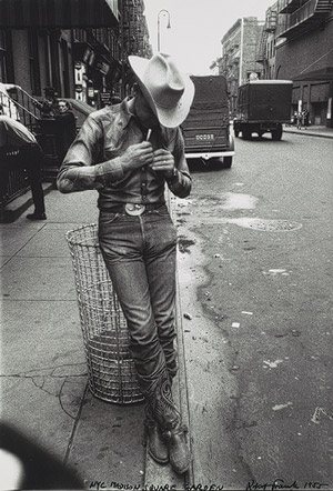
ROBERT FRANK @ the met


I'm a fan of Robert Frank's work which is what led me to see his exhibit at the Met. I've seen The Americans in book form, so it was strange and interesting to see them presented on the wall in that manner. The way they were set up, wrapping around the walls of several different rooms led you on a journey that was quite different from its book form. It was almost maze like and many people around me just chose to look at them out of order. But thats the thing about a gallery versus book format-- you don't have as much control of direction. The images are captivating and mundane at the same time, one of those "anywhere U.S.A." type of scenarios, but I had already seen that in the book.
What I found most interesting were the photographs that Frank decided to eliminate from the book. There was a whole wall of printed photographs and centerpieces of contact sheets. It shows the volume of work that the artist produced and what his elimination process was. For instance most of the photographs showed the subjects looking at something distant and unseen-- not at the camera. I noticed that some of the photos were of the same subjects making eye contact with the photographer. These are just interesting questions to think about, especially in terms of what to show in your own work. I mean, I'm not a photographer, but I feel that every artist must at some point narrow their scope of what they want to portray, what they like and the references they use. So, that part was beneficial to me.

10.23.2009

10.21.2009

SEVEN DAYS IN THE ART WORLD-CHAPTER2-THE FAIR

"Keller explains this approach: 'If you go after art and quality, the money will come later... We have to make the same decisions as the artists. Do they create great art that sells well? With the galleries, its the same. Are they commercial or do they believe in something? We're in a similar situation.'(p. 82)"

"There are no red dots on the wall. Such an overt gesture at commerce is considered tacky.(p. 87)" I never understood why there are so many rules. Its only an exchange of money, but it can't be treated like one.

"Unlike other industries, where buyers are anonymous and interchangeable, here artists' reputations are enhanced or contaminated by the people who own their work.(p. 88)" Who cares who buys the work? Money is money, right? I guess I just don't get the whole business/reputation relationship. Art dealers are more like politicians than business men it seems.

"Collectors may come and go, but a strong stable of artists with developing careers is essential to a gallery's success. In the business of museum-caliber art, supply is more delicate and dicey than demand.(p. 89)" A strong stable? I don't want to be in a "stable"...

The difference between dealers, as in artist-oriented dealers, collector-focused dealers and curators' dealers are outlined on page 91.

"In a world that has jettisoned craftsmanship as the dominant criterion by which to judge art, a higher premium is put on the character of the artist. If artists are seen by creating art simply to cater to the market, it compromises their integrity and the market loses confidence in their work.(p. 98)" How would they know if artists are working for themselves or "the market"? They want an artist who sells, but not one who intentionally makes art to sell?

10.15.2009

SEVEN DAYS IN THE ART WORLD - CHAPTER 6 - THE STUDIO VISIT

"On the back of his seat, a sign informs us that our driver's hobbies are (1) baseball, (2) fishing, (3) driving.(p. 184)" In Japan they announce the taxi drivers hobbies? I guess, as a means of making polite conversation. That's nice, I think, or strange. I've never had any desire to know that much about my taxi drivers, but it seems the feeling is mutual.

"One of Murakami's most visible commissions has been for the accessories giant Louis Vuitton. In 2000 the company's artistic director, Marc Jacobs, asked Murakami to reenvision 'monogram canvas'...(p. 186)" Many artists would call that "selling out", but not only is it a big commission, but it gives the artist exposure to alot of different people, which Murakami seems to be concerned with.
And again "Murakami was referring to Graduation, the hip-hop artist's third album, for which he also designed the singles covers and an animated music video.(p. 200)"

"Initially called the Hiropon Factory, in homage to Warhol's Factory and his manufacturing model of art production, it was renamed Kaikai Kiki in 2002, when Murakami reconceptualized his entire operation along the lines of a marketing and communications company.(p. 192)" I like all the comparisons between Murakami and Warhol. I love Warhol and that his persona was a work of art in itself.

"Murakami is a noncomformist in many ways, but he is utterly conventional when it comes to his Japanese work ethic, for Kaikai Kiki is typical of the nation's notoriously demanding corporate culture. (p. 200)"

"The DVDs of Hayao Miyazaki--the director of Spirited Away and other critically acclaimed animated features is one of Murakami's heroes--sat in an orderly row, while a wide range of art books (about colorists like Henri Matisse and masters of deformation like Francis Bacon) was mixed in below. (p. 201)" Its interesting how he draws from so many different styles that seemingly have little conversation with his work.

10.14.2009

examples: ROHAN MITRA'S WORK


and the moodline

BLOCKS OF COLOR


The "Blocks of Color" exhibit at the Zimmerli is comprised of many woodcuts arranged by time and style. The amount of prints is impressive but more impressive is how they managed to create a sort of timeline, beginning in the late 1800's. The earlier prints were done in the japanese style of using watercolor inks. I was more interested in these, although many were landscapes, still-lifes and classical subject matter, which I am not usually interested in.


^Helen Hyde, "The Family Umbrella"

10.05.2009

SEVEN DAYS IN THE ART WORLD - CHAPTER 2 - THE CRIT

"Look over the resumes of the artists under fifty in any major international museum exhibition and you will find that most of them boast an MFA from one of a couple dozen highly selective schools.(p. 47)"

"Everything goes to pieces in the first year and it comes together in the second year. Often the people who are making sense are the ones for whom it hasn't started working yet. They've still got their defenses up. Sometimes the person is simply uneducable and there is nothing you can do."
- Leslie Dick (p. 50)

"... the prevailing belief is that any artist whose work fails to display some conceptual rigor is little more than a pretender, illustrator, or designer.(p. 53)"

"Many artists believe that artists shouldn't be obliged to explain their work... It is curious that a form of oral exam has become the chief means of testing visual work. (p. 54)"

"Talent is a double-edged sword. What you are given is not really yours. What you work at, what you struggle for, what you have to take command of--that often makes for very good art."
- Paul Schimmel (p. 72)

10.01.2009

ROHAN MITRA interviewed by me

Q: Whats your concentration?

A: Graphic Design and Computer Science.

Q: What are some influences on your work?

A: Swiss design, 1950's design, street art (such as Shepard Fairey's work).

Q: Do you consider color an important part of your work?

A: I love color. I usually start out working in black and white and add color later. I love bright colors, especially primary colors. I like the simplicity of reds, blues and yellows. I'm also very careful about what colors go where and make sure each has a specific reason, such as a bright yellow can be used to highlight an important word or area.

Q: You mentioned that the size of your work is often very large. Is that a requirement for your class projects or do you prefer working in a larger size?

A: Actually, I don't like the larger size. I like smaller pieces and often print them smaller for myself to keep and I feel that smaller prints provide a more personal experience. My interest is more in interactive work, such as web design.
I'm also very interested in book design- both cover design and the interior design. I'm currently reading the book Design as Art by Bruno Munari, which I find very inspiring. He designed every part of it down to the typeface, margins and spaces between each line. I also have a thing for typography.

Q: Are you interested in text as a texture, or is it important that the words always be readable?

A: Both. I like that the letters create texture, but I think its pointless if you can't read the words.

Q: Would you say your work is art with a purpose?

A: Definately. Many people wouldn't consider my work fine art. I love graphs and tables and charts. Many artists would scoff at that, but I've always considered it art. People don't realize that when they look at a poster there is a system of proportions involved in the size and spacing and that is done consciously. Its still about positive and negative space and activating that space, just as it is in other types of art.

Q: Do you have an idea of what you'd like to do for thesis?

A: I want to do something interactive. I'm a double major in graphic design and computer science and I have a specific idea that incorporates the two.

CHELSEA GALLERIES

JOSIAH MCELHENY Proposals for a Chromatic Modernism @ Andrea Rosen Gallery
The bright primary colors and shininess of the glass appeal to me in the same way that children are drawn to candy. The simplicity of the shapes used force the viewer to appreciate the innate beauty in common objects and the surface of the glass.


BARTHELEMY TOGUO The Pregnant Mountain @ Robert Miller Gallery
The artist often offsets the soft, marble-like texture of watercolors with small hard-edged lines. The focus is often on monsters, or composite human/animal figures. Maybe its because of the medium or the subject, but the works seem to have an raw, earthy quality.


MAYA LIN
Three Ways of Looking at the Earth: Selections of Systematic Landscapes @ Pace Wildenstein
The name of the exhibition indicates that the spaces created were mathematically constructed, but the large scale installations have curves that seem to speak of the gesture.


9.22.2009

BUCKET OF BLOOD

so silly. i wonder if that would actually work. i mean, every time i have a critique and i know that my thing is a piece of crap and that i didn't care or spend enough time on it i always get a bunch of compliments. And usually when I work really hard on something, no one else likes it. maybe i'm trying too hard. being an art student is like constantly being slapped in the face. is that a good simile? maybe it's just a little melodramatic.

BAG, ALEX

The least that Alex Bag could do is to shorten the video. I get it. I got it after the first segment. The quality could be better. There is a lot of background noise, but maybe thats the point--to seem like some shitty you tube video. But then I could just watch some shitty you tube video which would probably be more enjoyable. I wouldn't call this art. I would call it someone who likes to hear themselves talk. The sarcastic tone makes me angry. I guess its easy to make fun of everyone else when you're some art star making dull, low quality videos involving very little effort. Also the part with the toys and cpr dummy is just fucking weird. I guess its attempting to be funny?

Normally when I do these assignments I try to list some good and bad qualities, but I think its time to be honest. And I'm in a bad mood. I'll re-watch it when I'm in a better mood and see if it sucks any less.

9.18.2009

NEW MUSEUM VISIT


The David Goldblatt exhibit was really impressive if only because of the amount of work he had. I also liked his presentation- some of the photos were just held up by paperclips, which was very simple and clean. His compositions were lovely, especially in the landscapes.
I was surprised when I saw that the  Emory Douglas prints were lithographs, because I've never seem lithographs look so smooth and clean like that. I don't know much about the process, but they usually look more expressive- like drawings.
I appreciated Dorothy Iannone's use of cut outs, but I found her focus on sex kind of cliche.
But I have to say that my favorite part was the balcony on top that looked over the city.